Six tips for mapping rural data
Working with rural data can be challenging, but CORI’s data team has some helpful tips to guide anyone seeking to map rural data.

Mapping rural data is hard! Between sparse populations, inaccurate data, and the challenge of defining what even counts as rural, creating accurate and meaningful maps can be a minefield.
In this blog post, I’ll cover six tips for mapping rural data that will prepare you to confidently tackle your next rural-centric mapping project.
1. Normalize your data
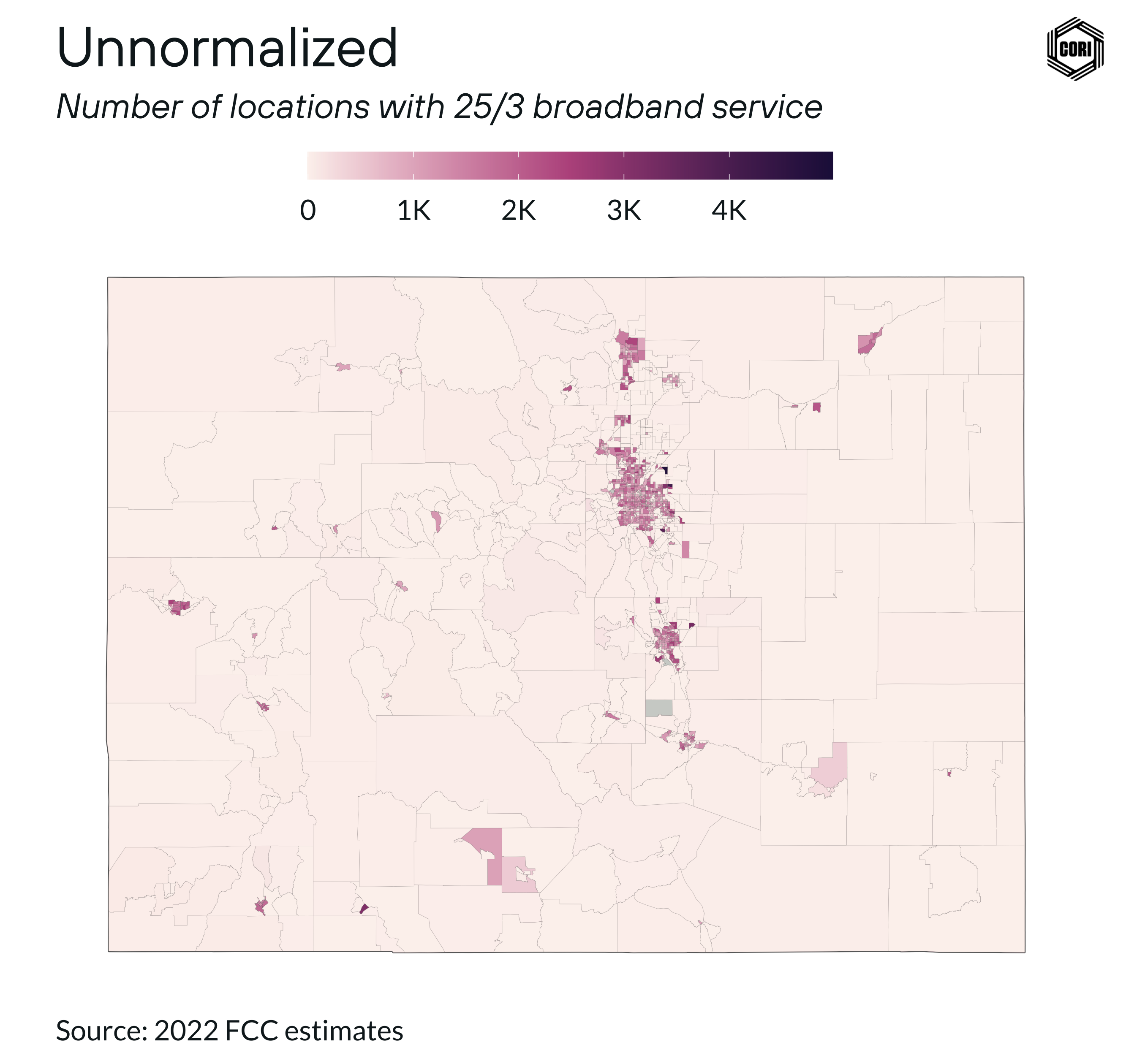
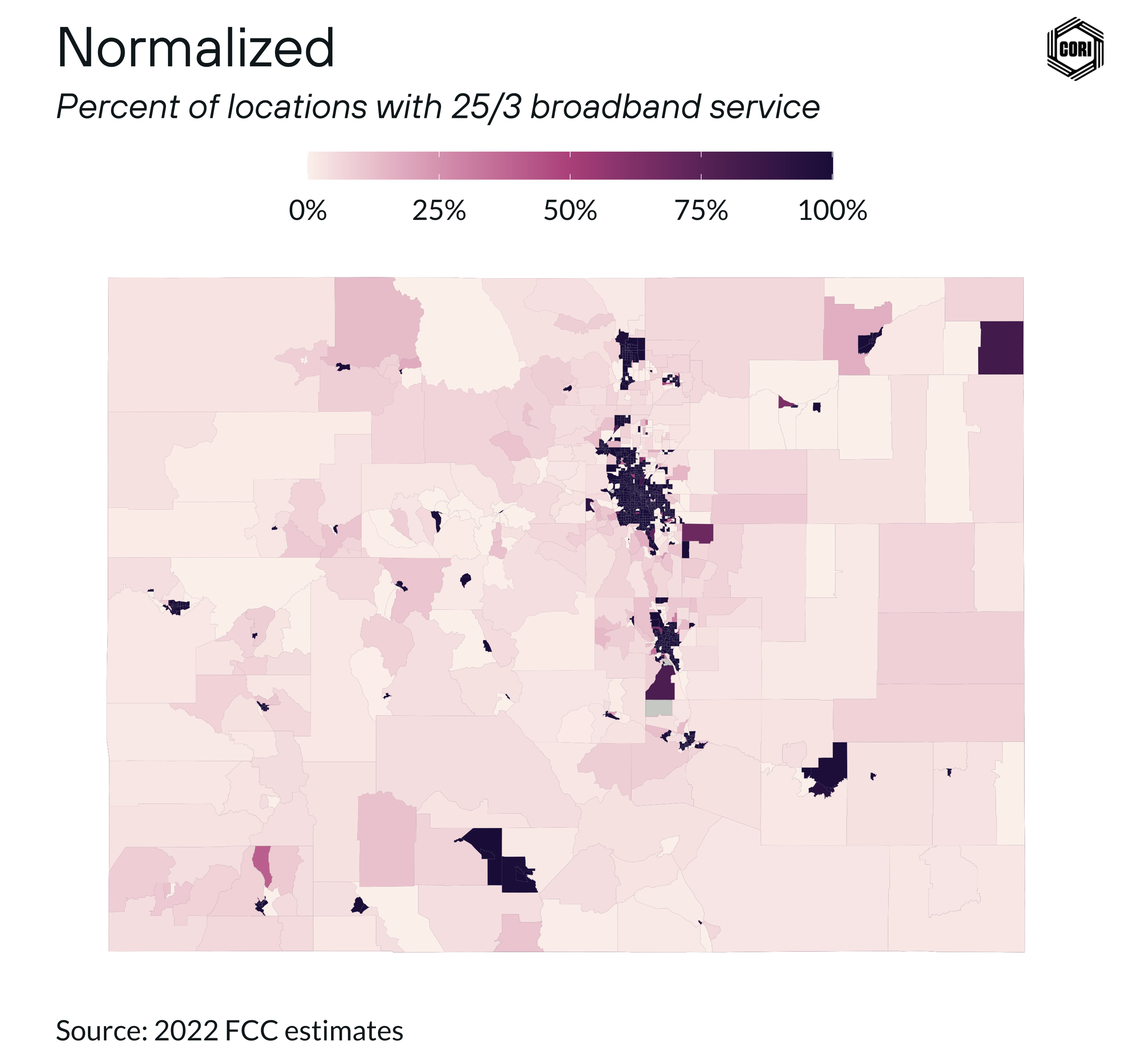
Rural data often spans large, sparsely populated areas, and the results of statistical analyses can significantly vary based on the scale and boundaries of the spatial units used. This phenomenon is known as the Modifiable Areal Unit Problem (MAUP) 1. To address this issue, standardize your data into rates or measures instead of raw counts (e.g., use population density rather than total population).
Here’s an illustration of this concept using broadband service data. The spatial trends are clearer and more meaningful in the normalized map compared to the unnormalized version:
2. Use smaller geographic units when available
In rural areas, data is often aggregated into large geographic units, which can obscure localized trends. When available, use smaller geographic units to capture more detail. This approach can reveal patterns that would otherwise be hidden in larger aggregations.
3. Separate rural and nonrural color scales
Rural and urban areas are socioeconomically distinct, and mapping them together can flatten rural trends. As such, consider using separate color scales for rural and urban areas.
If you need to analyze both simultaneously, use facets to display them side by side rather than blending them into a single map. This method helps preserve the unique characteristics of each area.
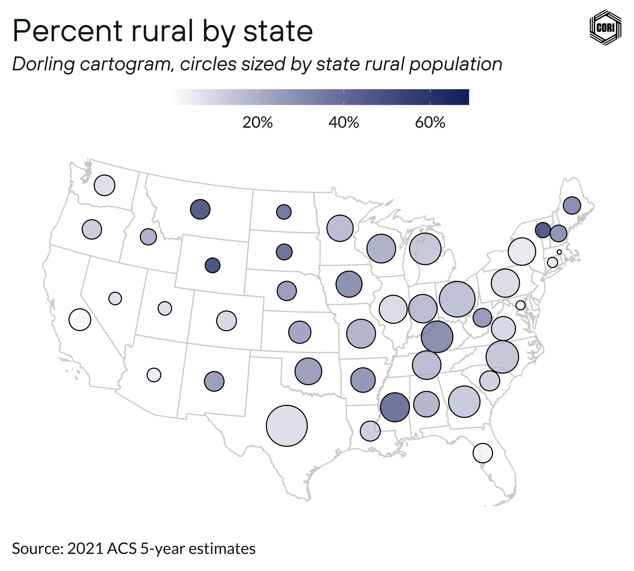
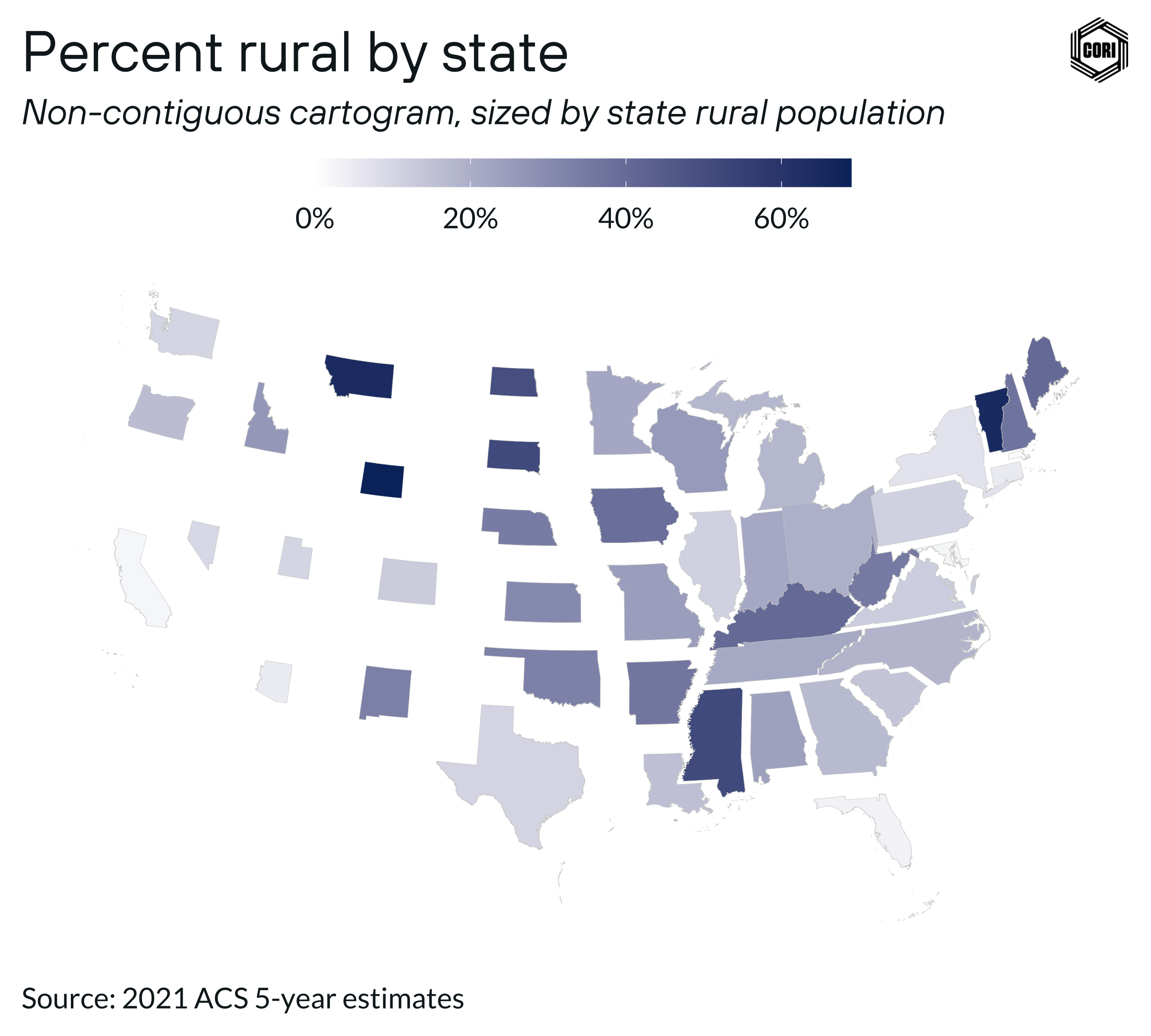
4. Incorporate magnitude
The size of rural geographic units often does not correlate with the population within those units. To highlight spatial concentrations effectively, add a measure of visual magnitude. Proportional symbol maps, dot density maps, and non-contiguous cartograms are useful tools for this purpose.
Below are two variants: a bubble map and a cartogram, both of which adjust the size of geographic units to reflect population data.
5. Use interactivity
Interactivity, such as tooltips that appear when hovering over an element or informational panels that appear on click, can enhance your map by providing additional context and details. I recommend reading through Axis Maps guide to Map Interaction to understand common conventions for interactive maps.
6. Consider non-map alternatives
While maps are powerful tools, they are not always the best choice for representing rural data. In some cases, alternative visualizations like swarm charts can more effectively convey your message. Don’t be afraid to think outside the map!
By implementing these tips, you can improve the clarity and accuracy of your rural data maps, making them more informative and actionable.
Interested in learning more about working with rural data?
This post is an excerpt from the CORI data team’s GitHub blog, where they share insights and key learnings from their in-depth work with rural data.
If you have questions about CORI’s previous work with rural data, or how we might be able to help with an upcoming data project, get in touch with the CORI data team today.