Next, you’ll have to figure out how to use your data to tell a compelling story.
A story is made up of information and a narrative — but too often, we use too much data to convey information, and not enough data as part of the narrative. The best use of data is interwoven, incorporating key bits of information into a wider narrative arc that compels listeners in both a personal and intellectual way.
We break it out into three components: setting, building tension, and resolution.
Setting
For setting, you need to give your audience enough community context to follow the rest of the story. Establish the “current state” of where you are, and provide information that builds interest in where you came from and where you’re going.
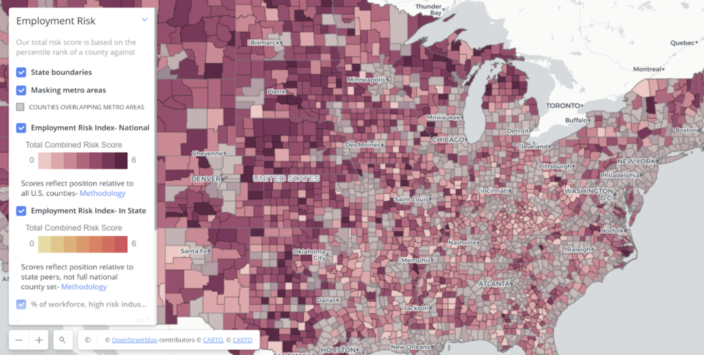
To find what data to use, think about the key economic turning points in your community’s history. How do they connect to the story you’re telling? The best data gives a sense of time (such as a trend chart) or space (such as a map). And make sure you’re choose-y: pick the two or three pieces of data that best illustrate the story (don’t overwhelm your audience with numbers).
Building tension
For building tension, you want to set up a problem that you’re eventually going to solve. Tension gives listeners a reason to be interested, to feel like they have a stake in your work. We have three key tips for building tension:
- Try to present something unexpected. Data that challenges the status quo offers key insight. Data that contradicts or adds nuance to your community’s dominant narratives position you as an innovative thinker — but be sure to have a good explanation for why the unexpected really is true.
- Use benchmarks to create dynamic tension. Benchmarks ground audiences while creating contrast — the best are relatable directly to your audience. The best data points for benchmarking add to a story arc, by showing, for example, “we’re falling behind,” or “we’re ahead but can’t lose momentum now.”
- Reveal through behavior. Resist the tendency to just use data directly related to the issue you’re most concerned about. Sometimes, what you should look for is how those data points affect behavior that has economic significance. Showing the impact on behavior can be more powerful than data on the issue itself, especially if it’s tied to real dollars.
Resolution
For resolution, think in terms of the “so what?” and the “now what?” Once you’ve built tension by laying out challenges, you have to convince people why they should care.
Use data that helps clearly convey what you should have learned from the presentation, and what insights can be gained from the key learnings presented. Then, you need to close with a powerful proposal — the “now what?” Here you need to give a clear answer to the challenge you’ve illustrated.
Projections are a powerful use of data in this context, offering more empirical legitimacy than just optimism about your idea. However, be sure that you understand the assumptions you’re making for your projections; there’s always a shark in the audience ready to call you out for weak assumptions. Data can also help bring resolution by adding concrete numbers to your outputs, outcomes, goals, and budgets.
With data integrated into your story, you’ll be positioned with a powerful narrative that inspires and convinces stakeholders to respect and support your idea. As you continue your work, here are a few more best practices to keep in mind as you use data to tell your story:
- Figure out your story (and be mindful of your audience). Data can help you tell a story, and it can help you discover a story, but it’s not a story on its own. Think about the stories that you and others tell about your community and economy. Are there other ways of telling it? Are there pieces that are missing? Have you tested all of your assumptions?
- Think of data like a tool. First, you have to know its purpose. Second, you have to practice using it. Third, watch how someone else uses it. And always know where the data you use comes from.
- Use data from different sources and display it in different ways. Visual assets like charts, graphs, maps, call-out boxes, etc are a great way to share the data. When you read the news, reports, or decks from other organizations, pay attention to the types of the data they use and how they present it.
- Bring a data expert onto your team. Build connections with local economic data experts and bring them into your effort as volunteers or board members. You might find such experts among the faculty at a local college or university, in the city or county planning department, or within your innovation ecosystem.
- Practice, practice, practice. The best way to become skilled at using data to tell your story is to practice. Push yourself to try new ways of using data in presentations, proposals, and reports. You can’t improve without feedback on what works and what doesn’t work.
With this toolbox, you’ll be well equipped to use data to tell your community’s story in a persuasive and engaging way. Using data is a prerequisite for modern work. Use it right, and you’ll be in a position to succeed.
Stay connected
Looking for more tools to add to your digital economy toolbox? Check out CORI’s Rural Innovation Initiative Community Toolkit and be sure to sign up for our newsletter to learn more and stay up to date on new toolkit releases.

